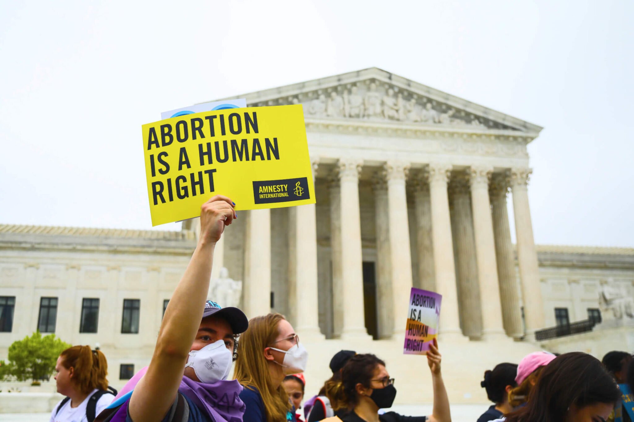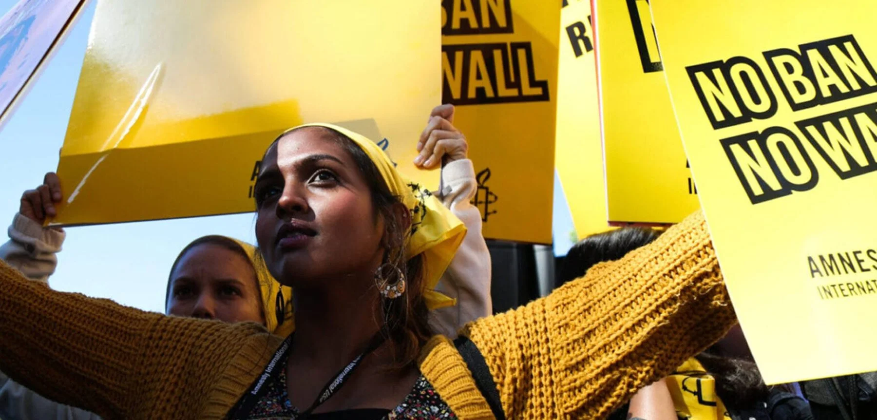
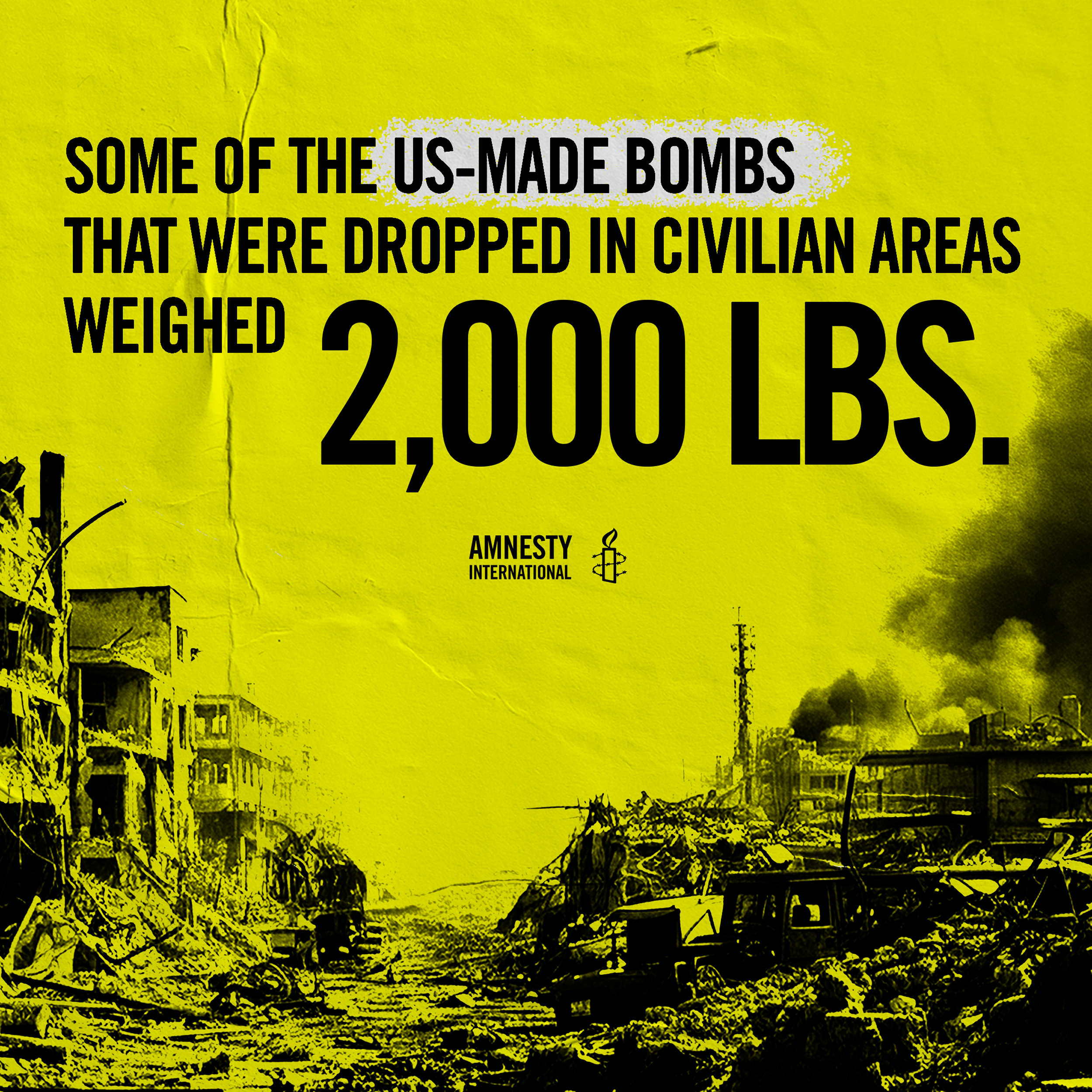
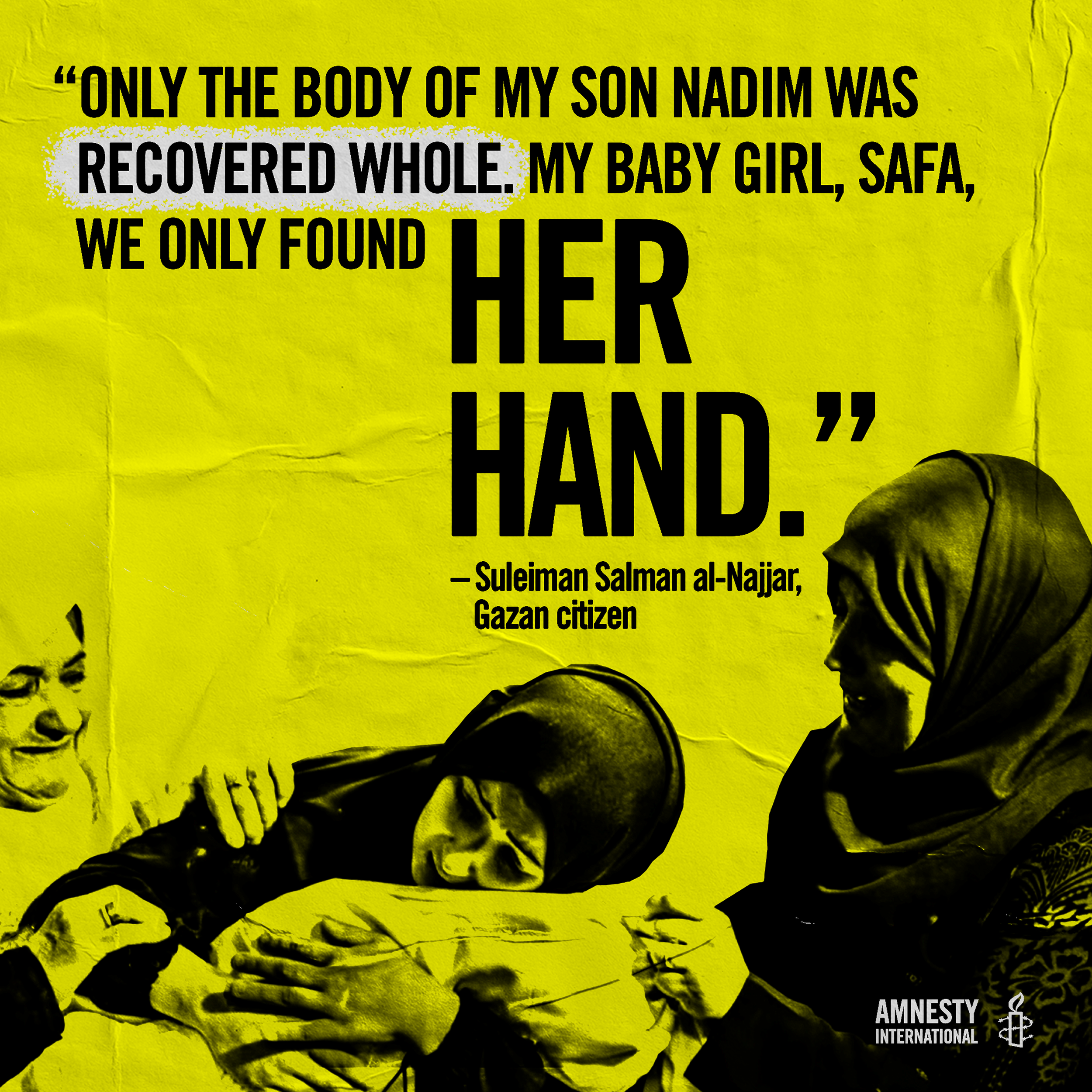
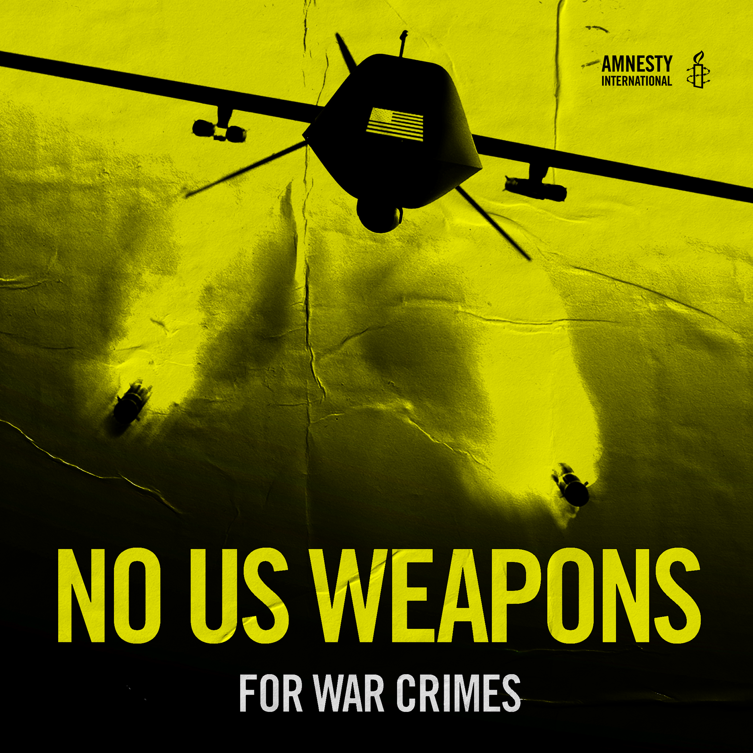
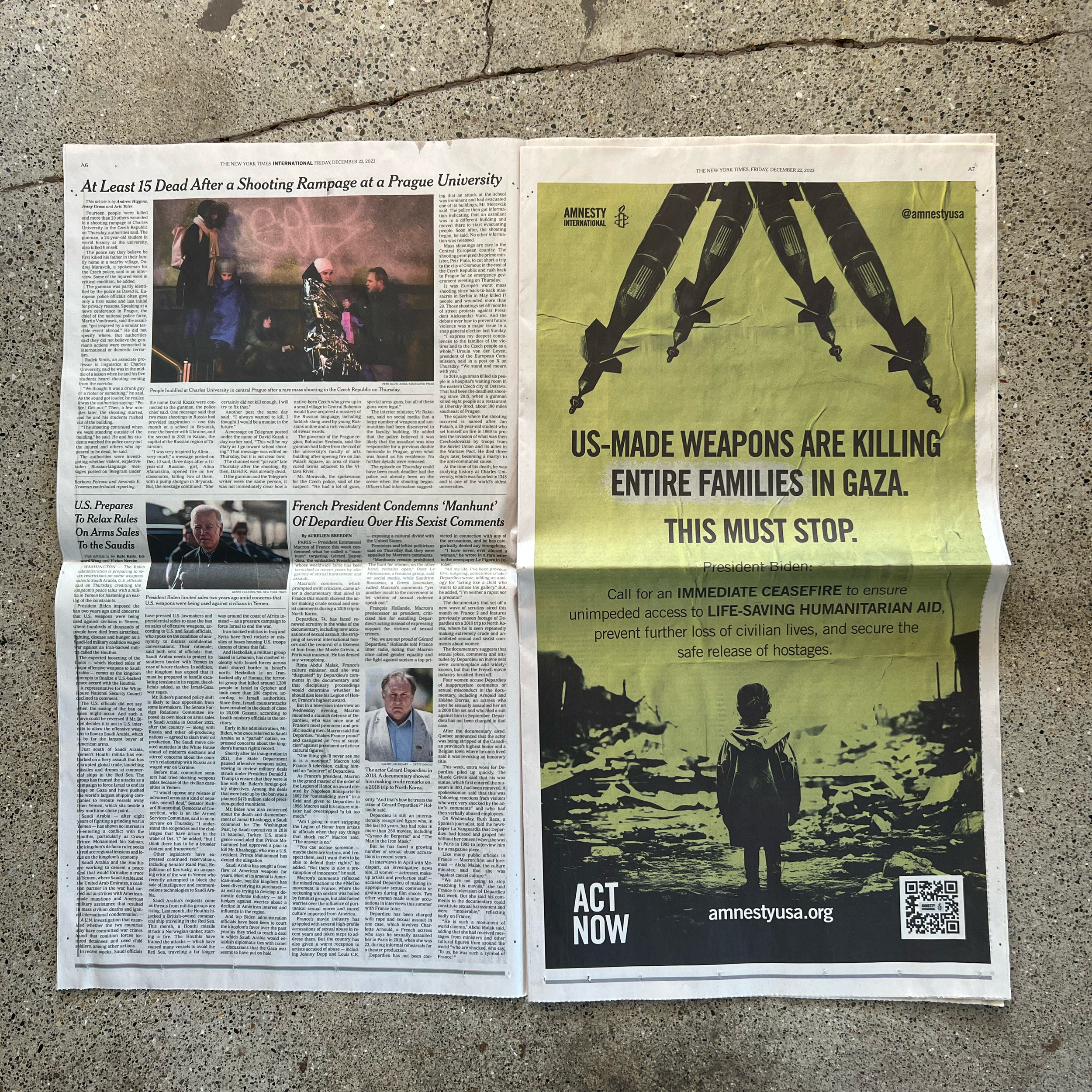
HUMAN RIGHTS FOR ALL
THE PROJECTAmnesty International is a global movement of more than 10 million people who take injustice personally. When Amnesty launches human rights campaigns, As Art Director for this client, I conceptualized & guided campaign visuals that bring each fight for justice to life. My team & I constantly pushed to expand their visual brand—beyond yellow and black—with new styles, colors, and animations that communicate Amnesty’s message in an inclusive, captivating, and engaging way.

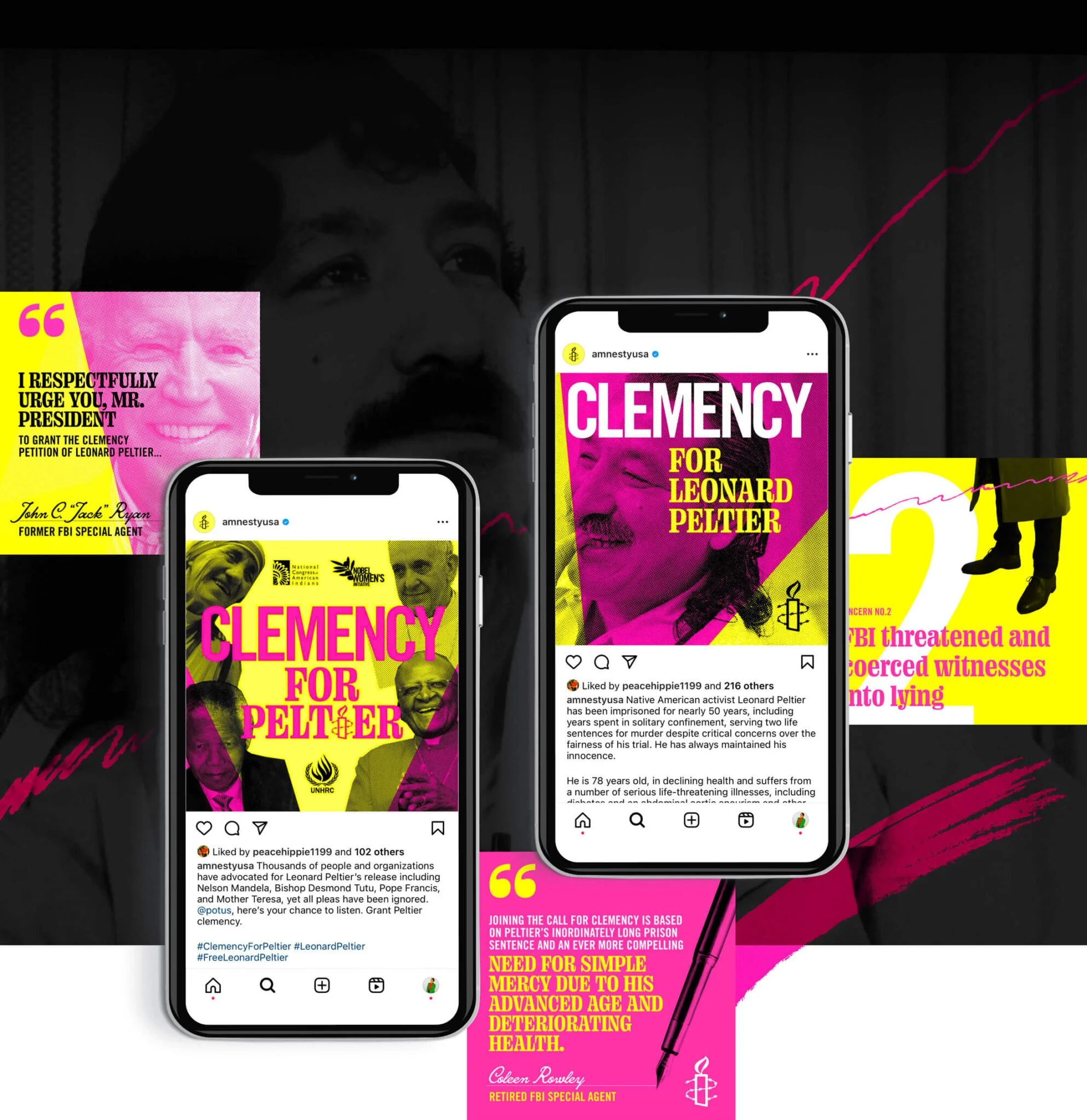
FLEXING A BRAND FOR EVERY CAMPAIGN
CAMPAIGN WORKAs Art Director, working with Amnesty was a dream. Besides working with a cause I believe in, their innate bold styling and minimal, but solid styles lent themselves well to impactful and meaningful designs. However, Amnesty was also open to flexing and introducing new styles to nearly every campaign. We discussed the need for need to mix things up and make each campaign branded at it’s core, yet visually distinct enough from each other.
Below are a selection of different campaigns, each flexing and expanding on the branding in different ways. From sticking closer to core styles or introducing eclectic, vivid new approaches, they all are ‘Amnesty’ at their core, but just distinct enough to stand on their own.
ANNUAL GENERAL MEETINGS
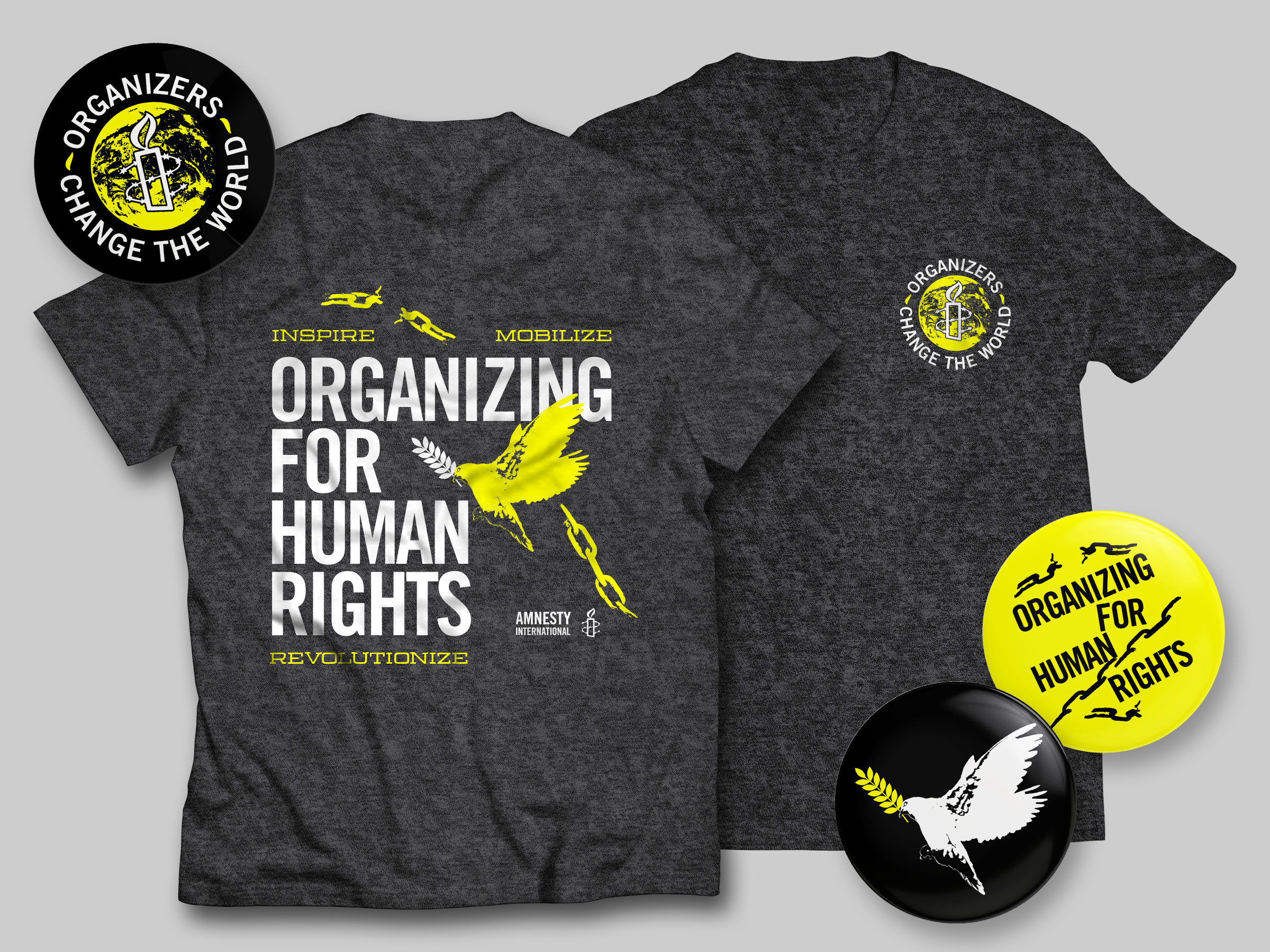
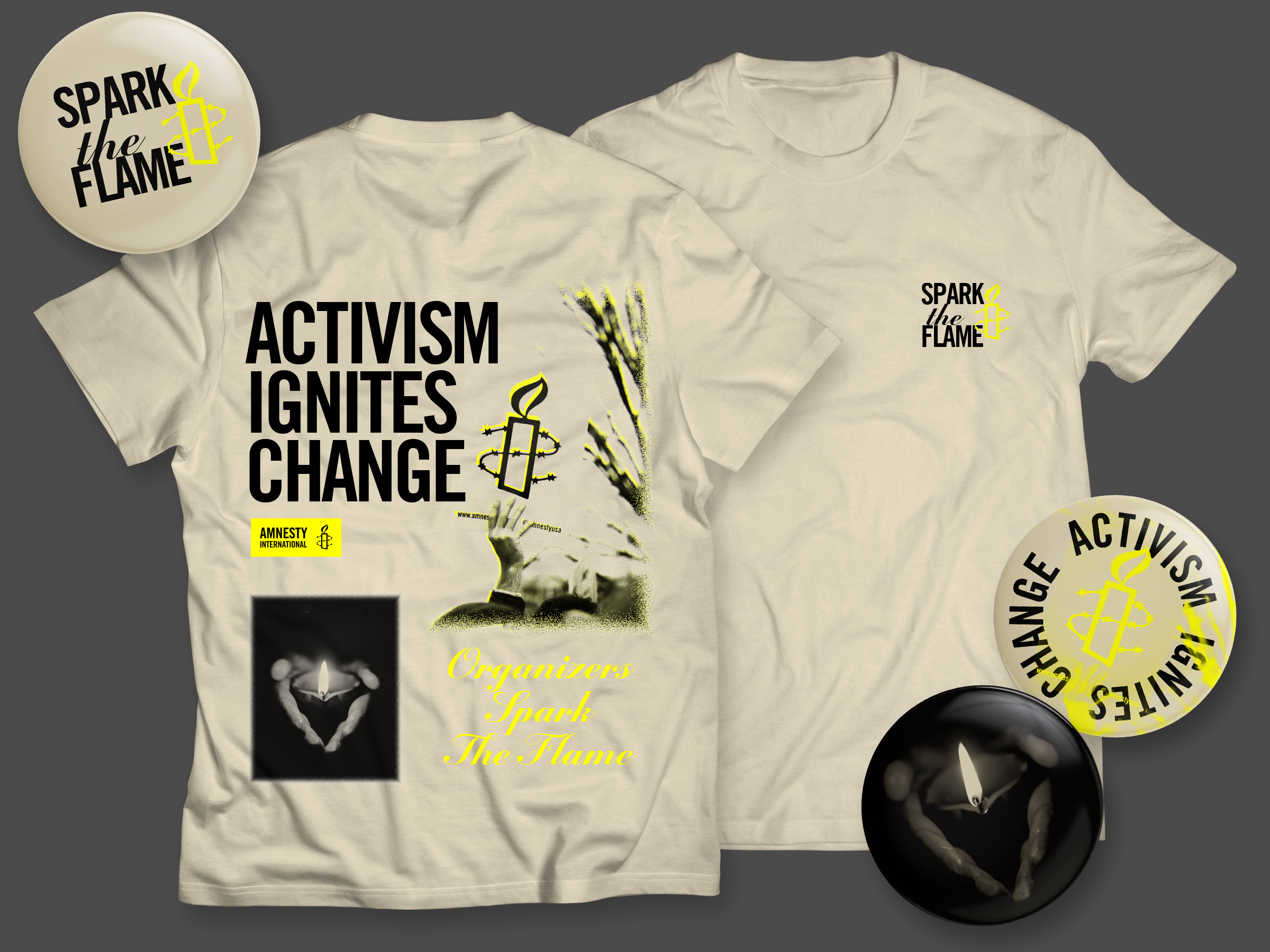
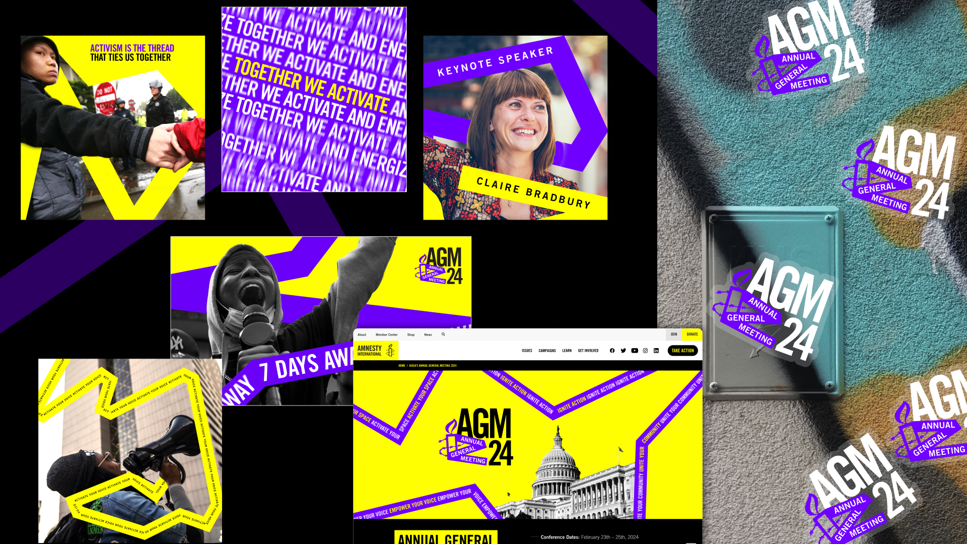
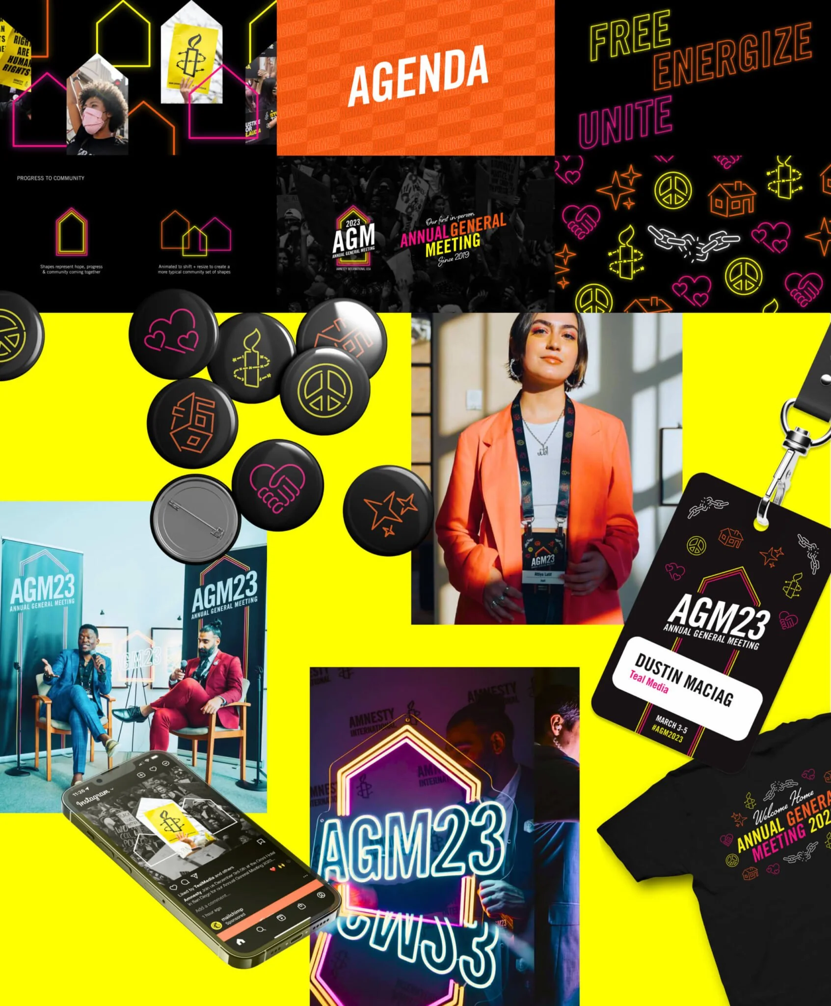
ANNUAL EVENT BRANDINGFor the past several years, my employer has provided branding and design support for Amnesty’s premiere event – the Annual General Meeting (AGM). Typically, Amnesty will come with a general idea and it will be my team’s job to conceptualize a full campaign brand, from logo to merch.
In 2024, the visual identity focused on the idea of activation, and the visual identity emphasized constant movement. It explored the conviction that each person is a small but necessary piece of a greater whole, all acting together to light up the world through activation of voices, spaces, and communities.
2023 was a homecoming. This was the first time since COVID that the Amnesty community was able to to come together in an in-person setting, which meant that we needed to convey the energy of Amnesty volunteers and activists and exude a spirit of togetherness and coming home. The visual identity was rooted in the concept of healing and bringing light—much like a neon sign being turned on and its brightness fills the room. We doubled down on this concept with a neon-esque color palette and simple geometric shapes that resemble neon art.
ROLE & RESPONSIBILITIES
ROLE & SKILLS EXPRESSED IN THIS PROJECTBrand Design
Art Direction
Video Direction + Storyboarding
Merchandise Design
Print-Ready Preparation